Wednesday, January 31, 2018

Super Sons

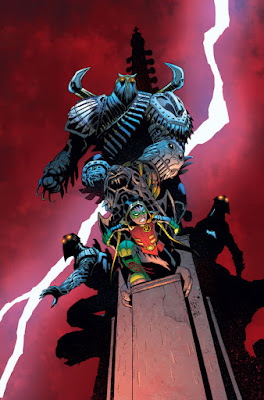
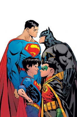
Patrick Gleason's Cover for Superman (2016) #10
Patrick Gleason's Cover for
Superman (2016) #10
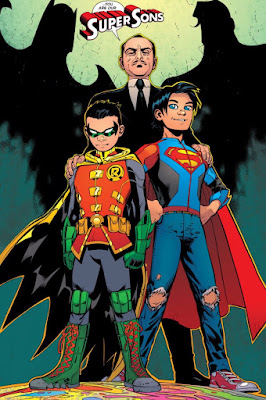
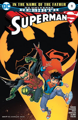
Visually, I really like what Patrick Gleason & crew have done with the current Robin, i.e. Damien, son of Batman.

I especially enjoy the current Super Sons team-up. These young lads and their attitudes crack me up.

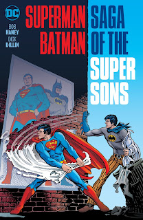
Back in my day, the super sons were depicted as teenagers/young adults as this cover for the collection of World's Finest Comics featuring the pair illustrates.
Superman/Batman: Saga of the Super Sons (World's Finest Comics collection)
Superman/Batman:
Saga of the Super Sons


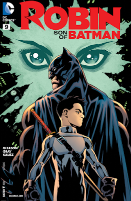
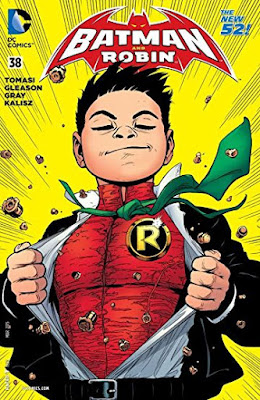
Below are some examples of Gleason's work with Damien and his partner in crime... fighting.

While depicted as younger than the super sons I'm used to, I have a "cutsie" streak in me that enjoys the exaggerated forms in some comics aimed at younger audiences.
Patrick Gleason's Robin Fighting Man-Bat
Robin: Son of Batman (2015) #9
Batman & Robin (2011) #38
Robin from Robin War (2015)
Batman & Robin (2011) #5
From Superman (2016) #11
Superman (2016) #11
Superman (2016) #11

Tuesday, January 30, 2018

Moving Paintings

On Tumblr this morn, I saw these really cool clips from Thor: Ragnorak (though I have not seen the film myself yet). What impresses me here is how the slow motion and shifting light make the images look more like paintings being animated rather than just movie clips.
http://kickasswomenofcomics.tumblr.com/post/170293904357/fuckyeahladiesofthemcu-theres-a-great-shot
They reminded me of an earlier post I wrote about actual paintings that have been animated.


So cool.

Sunday, January 28, 2018

TomKellyART

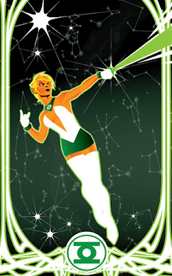
"Arisia: GL Power" by Tom Kelly
"Arisia: GL Power"
I am a big fan of TomKellyART (one of the artists I follow on DeviantArt).

While not every piece appeals to me (as would be true of any artist), he has an extensive gallery, and by far I like the vast majority of his pieces.

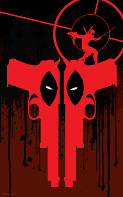
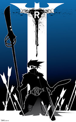
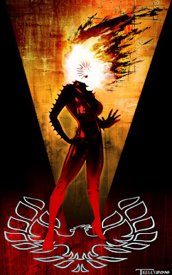
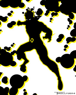
I most enjoy the vector and art deco-ish design pieces he creates as cover illustrations or pin-ups.

Of course, I have selected mostly super-hero examples in the gallery below but he has pretty good range so I recommend checking out his full gallery for yourself.


I like the silhouette suggestions of each figure with background details to clarify the context/identity of the character.

I find his design choices generate a logical element for my brain to chew on while the whole composition reveals the core emotional context of the character.

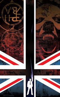
"Constantine: Black Flag" by Tom Kelly
"Constantine: Black Flag"
For example, the "Constantine: Black Flag" design has the British flag at the bottom (Constantine's a Brit) with its vertical bar extended upward to create an inverted cross shape at the bottom (a sign of the devil).

In the upper left quadrant there is arcane symbology suggesting alchemy and demon warding, and there is a vampiric face (a screaming open mouth with fangs) in the upper right quadrant with more textual symbology over the face ("666") and along the cross bar of the flag ("villain" & "devil") suggesting Satanic forces.

Finally, there is the small figure in stark white with Constantine's characteristic cigarette smoke rising from the figure. The size of the figure in contrast with the darker reds and black "evil" elements suggests the enormity of the task Constantine has before him fighting horrific supernatural forces on behalf of humanity.

MORE of my FAVORITES:

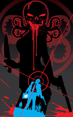
"S.H.I.E.L.D.: Hydra's Shadow" by Tom Kelly
"S.H.I.E.L.D.: Hydra's Shadow"
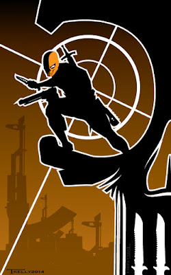
"Deathstroke: Dead Eye" by Tom Kelly
"Deathstroke: Dead Eye"

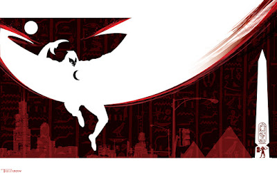
"Moon Knight: Infrared" by Tom Kelly
"Moon Knight: Infrared"

"Two-Gun Deadpool" by Tom Kelly
"Two-Gun Deadpool"
"Damien: Lethal Robin" by Tom Kelly
"Damien: Lethal Robin"

"Rachel Summers: Phoenix" by Tom Kelly
"Rachel Summers: Phoenix"
"Sunspot" by Tom Kelly
"Sunspot"

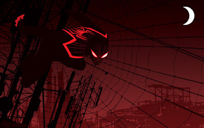
"Miles Morales: Spider-Man" by Tom Kelly
"Miles Morales: Spider-Man"

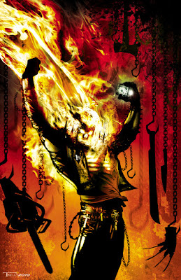
"Ghost Rider: Commission" by Tom Kelly
"Ghost Rider: Commission"
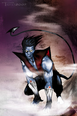
"Nightcrawler" by Tom Kelly
"Nightcrawler"

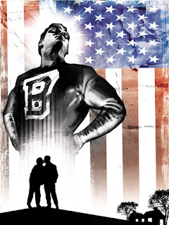
"Brilliance" by Tom Kelly
"Brilliance"
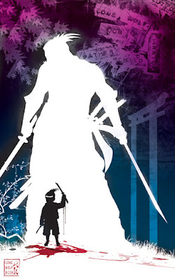
"Lone Wolf & Cub" by Tom Kelly
"Lone Wolf & Cub"

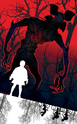
"Stranger Things: Stranger Danger" by Tom Kelly
"Stranger Things: Stranger Danger"
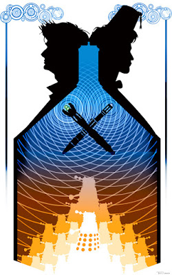
"Doctors Who vs. The Daleks" by Tom Kelly
"Doctors Who vs. The Daleks"

Saturday, January 27, 2018

Wednesday, January 24, 2018

The Atrumpocalypse continues 2017--????

Who knew the consequences would be so dire? 
Daffy Duck-Ass Destroyer courtesy antipahtico (age 17+ only) via lyrafay
Daffy Duck-Ass Destroyer

Flammable Pure Raw Honey Poo courtesy antipahtico (age 17+ only) via lyrafay
Flammable Pure Raw Honey Poo

Mickey Strike-Face Mouse courtesy antipahtico (age 17+ only) via lyrafay
Mickey Strike-Face Mouse

(Images courtesy antipahtico (age 17+ only) via lyrafay. Apologies to all for the names.)

Tuesday, January 23, 2018

Chess: Jim Lee's Cover Art for Batman (1940) #619

Jim Lee & Scott Williams' Cover
for Batman (1940) #619
Visual metaphors can become tired and repetitive, but I find a great one (with beautiful art and specific details) can make up for the reuse of the, perhaps, overly familiar construct.

Case in point is this 2003 cover by Jim Lee and Scott Williams that depicts the Batman universe of villains and heroes as pieces on a chessboard.

Even though the chess metaphor has been presented innumerable times across a variety genres and mediums, it still has the power to convey a ton of content.

Here the Riddler is the chess master positioning the players on the board. He is moving Hush (the titular villain of the collection in which this issue falls) into position to take on the Batman chess piece at the front of the image.

Batman is in a "ready-for-action" pose, but he is face forward as if blind to all the peripheral pieces on the board as well as to the arrival of the Hush chess piece.

The cover artwork's metaphor basically functions as a plot summary for the content of the issue (including potential spoilers).
Close-up detail of Joker's T-shirt "I killed Jason Todd, and all I got was this lousy t-shirt"
Lovely details include the custom text on Joker's T-Shirt ("I killed Jason Todd, and all I got was this lousy t-shirt") and the postures of the female villains. Poison Ivy is seductive with her chest out and her hand on her hip.

Close-up of Poison Ivy as a chess pieceCatwoman is crouching like, well, a predatory feline (while also somehow managing to stick her chest out), and Harley Quinn has her signature boardwalk carnival mallet (yet she, too, is turned incidentally, I'm sure, to reveal her ass and chest at the same time).

Seriously, though, Catwoman is revealed as an ally of Batman given the color of her chess piece's base (gold like Batman's while the villians' bases are all silver).

I find this cover to be a very effective use of chess as a visual metaphor.


Sunday, January 21, 2018

Perspective

Page from "Green Arrow" (2017) #33 by Jamal Campbell (art) & Benjamin Percy (words)
Page from Green Arrow (2017) Issue #33
by Jamal Campbell (art) & Benjamin Percy (words)
I find it difficult to articulate what I like in comics without the words & images right there to which to make reference.

Articulating what makes some artwork exceptional compared to others is even harder.

I tend to err on the side of explaining what I think has been done really well instead of criticizing what has been done poorly.

Given how personal our reactions are to art, I find it undesirable to try to persuade any reader to take on my perspective; I merely want to share what I enjoy and try to discover why I enjoy it through the sharing.

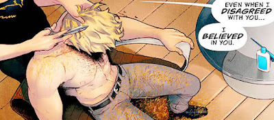
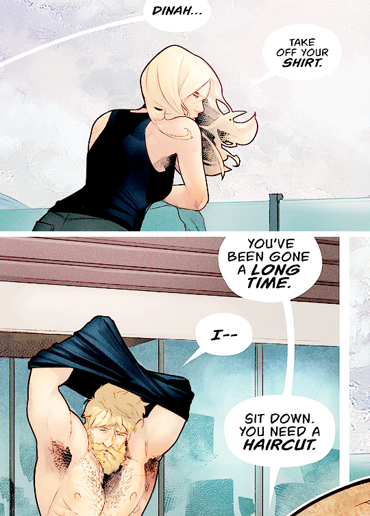
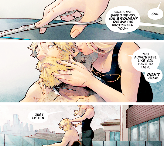
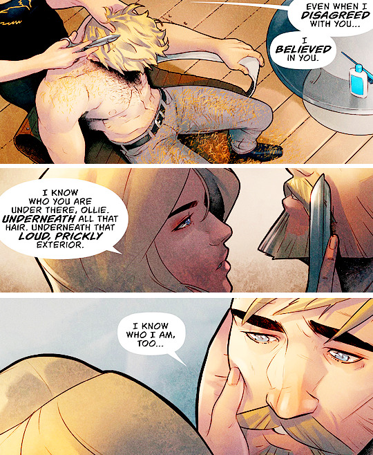
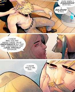
For example, I love how the "camera" movement between each panel on this page from Green Arrow (2017) #33 flows from Dinah's perspective.

Page from Green Arrow (2017) Issue #33 Panel #1
Page from Green Arrow (2017) Issue #33 Panel #1
As Dinah looks down on Ollie in the first panel the writer&artist establishes that Dinah is in charge (even while she is care-taking Ollie by cutting his hair). The bolded text in her dialogue balloon reinforces the idea that Dinah is using an authoritative tone with Ollie while she is essentially "in control" of him from above.

Page from Green Arrow (2017) Issue #33 Panel #2
Page from Green Arrow (2017) Issue #33 Panel #2
The camera then moves in for a close-up as Dinah moves around Ollie and squats in front of him. In this profile shot, Dinah ends up slightly below Ollie. While the scissors could look like a threat (positioned on Ollie's face as they are with his chin tilted up), Dinah's dialogue talks about knowing who Ollie is underneath the "prickly" surface. She is literally getting underneath Ollie and grooming Ollie's surface to reveal the man she knows.

Page from Green Arrow (2017) Issue #33 Panel #3
Page from Green Arrow (2017) Issue #33 Panel #3
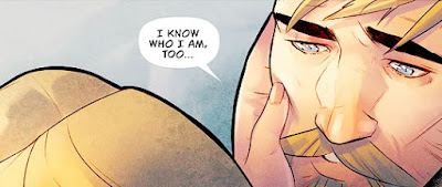
Then the camera moves with her (though now behind her) as she makes eye contact with Ollie, and we get to see the soft expression on his face as he responds to the intimacy the shift in her dialogue and actions in the move from panel 1 to panel 2 indicates.

Again, Deron Bennett's choices as letterer (this time shrinking the words while leaving the speech balloon a little larger) suggests the words are spoken softly and deliberately.

This perspective and movement of the "camera" are elements exceptional artists (or artist teams, really) create when designing the logic flow of their story.

This page has been taken from dinah-lance's Tumblr which excerpts more panels from this issue:
Excerpt from Green Arrow (2017) Issue #33
An Excerpt from Green Arrow (2017) Issue #33

Another Excerpt from Green Arrow (2017) Issue #33
Another Excerpt from Green Arrow (2017) Issue #33

Yet Another Excerpt from Green Arrow (2017) Issue #33
Yet Another Excerpt from Green Arrow (2017) Issue #33


Saturday, January 20, 2018

The Blending Art: "Twister"

Blended Art by summersocietyvp Runaways: Season 1, Episode 2: "Rewind" // Volume 1, Issue # 2, "Pride and Joy"
Runaways: Season 1, Episode 2: "Rewind" // Volume 1, Issue # 2, "Pride and Joy"

Now, this is the type of art I would like to learn how to do. In this animated gif,
summersocietyvp (someone I now follow on Tumblr) has taken a brief clip from the new Hulu series Runaways and married it up with a panel from the original source text, a comic of the same name by Brian K. Vaughan (words) & Adrian Alphona (images).

I particularly like the design choices that went into this piece of art. First, keeping the frame from the source panel constant throughout the gif reinforces the logic of the comic being the source text that encapsulates the new video adaptation.

Second, I like how the video clip has just enough frames to generate movement (to make it clear that it is a video clip and not a still picture) but not so many as to overwhelm the gif and distract from the comic panel frame. (This also keeps the gif short for any attention-deficited viewers.)

I also like the touch of leaving the speaking balloon in place when switching from the comic panel to the video clip but changing the text content in the speaking balloon to create a sense of linear logic flow: the greeting in the comic panel balloon ("Oh, hey, Mom") is followed by the logical follow-up question: "How was the meeting?" in the video clip balloon.

Runaways (2003) Issue #2 Cover by Jo Chen
Runaways (2003) Issue #2
Also, summersocietyvp manages to blow up the comic panel large enough to fit the video clip without losing too much quality in that comic panel image. And, the decision to cut out the door frame from the source panel to reveal the edge of the Twister game and the video image (of an AT-AT Walker from The Empire Strikes Back) on the TV within the video clip is masterful.

I have read the comic, but I don't have Hulu and thus have not seen the series yet. However, this gif does suggest that the TV series honors the original source text while still adapting the story into something new. That's good advertising, if you ask me.

Wednesday, January 17, 2018

Neo-Punk Pumpkin Bear

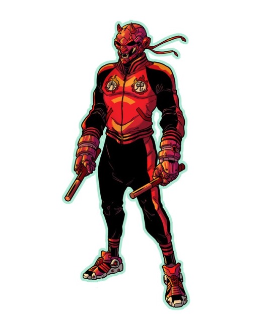
Neo-Punk Redesign of Marvel's Daredevil by Rhoald Marcellius (thepumpkinbear)
Neo-Punk Daredevil by thepumpkinbear
I love trying to look up the people I encounter through Tumblr.

First, most of the blog names are great: kitchenwitchcraft, shankinzombie, superheroesincolor, & thepumpkinbear to name a few.

Plus sufficient bio data is rarely available on the site, so a Google search becomes necessary.

Usually, since I tend to follow artists or people who love art, I discover their similarly named Twitter, Instagram, and/or Deviant Art sites (though, sometimes the bio data found on them is minimal as well).

And I find I -- as an old fogie -- typically have to look up terms and cultural references used by the Tumblrs because I am that far out of the loop these days.

Case in point, thepumpkinbear's redesigns for some of Marvel's main characters in what thepumpkinbear denotes as a "neo-punk" style. I looked up neo-punk online and found little beyond the root words' definitions on the traditional dictionary sites: "new" + "punk."

The Urban Dictionary offers little better (in part because it seems very little consensus exists on a definition for the term). However, despite my lack of understanding as to what constitutes "neo-punk," I enjoyed thepumpkinbear's re-visioning of these Marvel characters embedded below.

http://thepumpkinbear.tumblr.com/post/164743699616/marvels-neopunk-did-this-for-fun-but-i

Tuesday, January 16, 2018

Monday, January 15, 2018

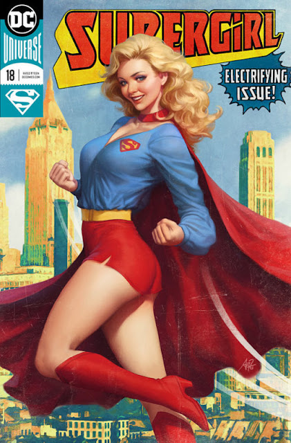
What an Anatomically Incorrect Piece of CrapTart!!

Another Anatomically Incorrect Piece of CrapTart by Stanley Lau (Artgerm)!!
Stanley Lau (Artgerm)'s Supergirl (2016) #18

And the irony is, I actually like a lot of Artgerm's work and follow him on Deviantart. I can put up with the pin-up style (especially as homage to an earlier, less equitable age), but only if one doesn't distort the anatomy of the figure to accentuate the T&A.

Accentuate T&A, if you must, but don't render his/her/their anatomy beyond human capacities (if you are doing representational art of a human figure).

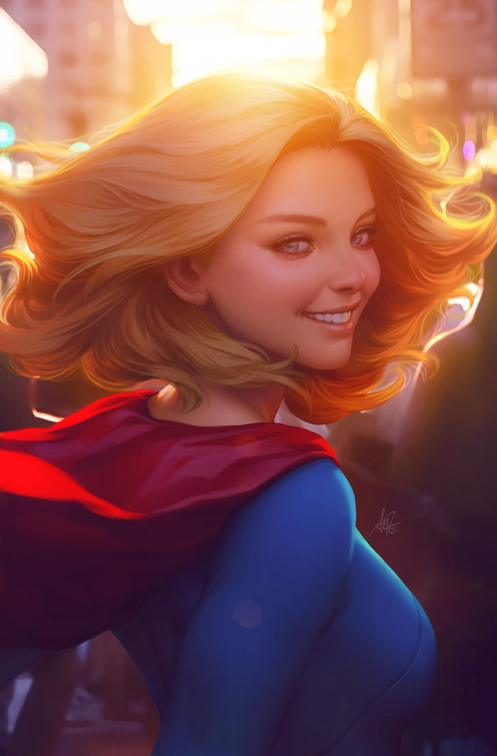
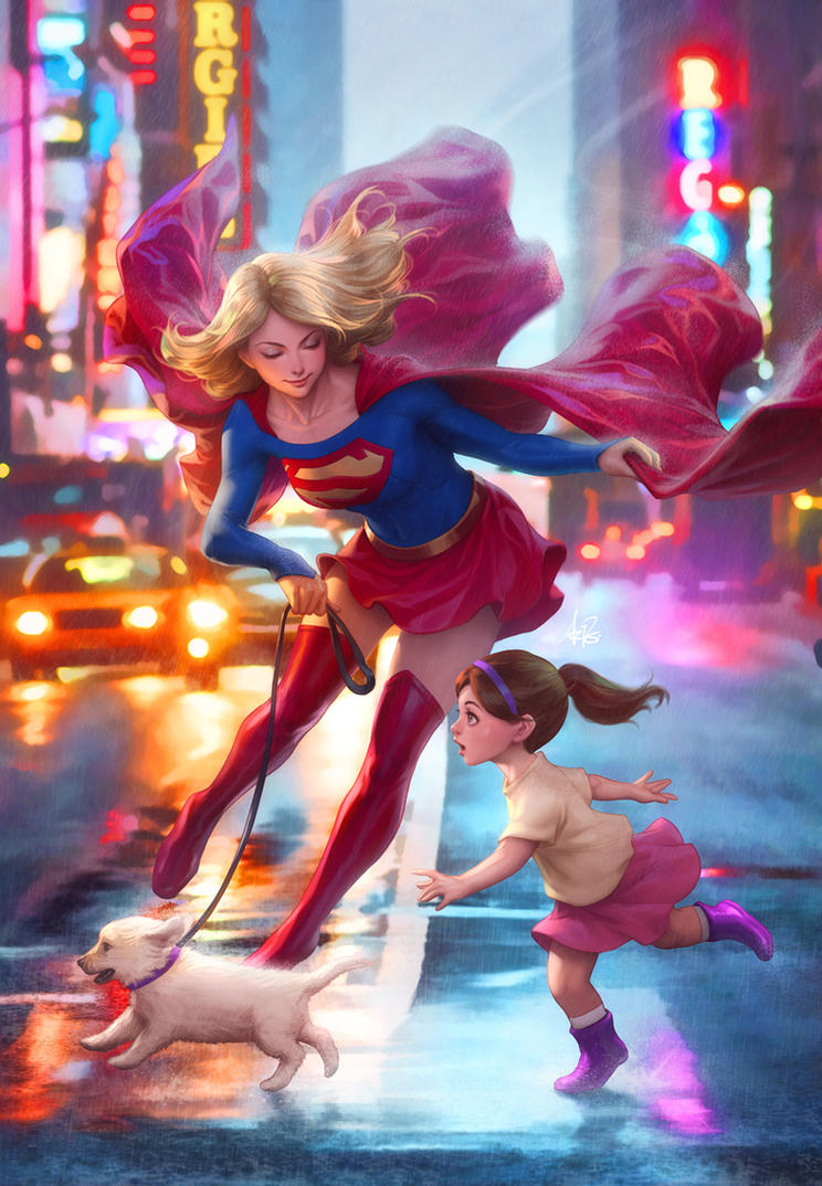
Here's a couple of his better pieces for Supergirl:

"Supergirl Next Door" by Artgerm
Artgerm's Cover for Supergirl (2016) #17